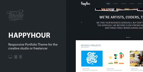
HappyHour is responsive WordPress theme based on 960 Grid System. It is optimized for Retina Displays (used in iPhone, iPad, iPod Touch and MacBook Pro Retina). Best for the digital or creative agency, design studio, web-development company or freelancer.
Theme Features:
- Minimalist design
- Dark and Light skins included
- Easily customizable
- 960 Grid system
- Cross Browser support
- Fully Responsive Build
- Retina Ready
- HTML5 + CSS3
- WordPress 3.5+ Tested and Ready
- Powerful Theme Options Panel
- Custom Widgets: Dribbble Shots, Flickr Images, Last tweets
- Contact Form with Google Map
- Coming soon options
- Slider Module
- Posts Pagination with AJAX Support
- Post Formats support
- Localization support
- Extensive Documentation
- Layered PSDs for Customisation
Screenshots:


ThemePile WP Framework:
All our themes are built on the ThemePile WP Framework

Need Support?
If you have any questions that are beyond the scope of this document, feel free to pose them in the dedicated Support Center.
We take pride in our customer support and we will do what we can to assist you.
Theme Changelog
HappyHour version 1.0 See Changelog


0 Response to "InHappyHour: Responsive Portfolio WordPress Theme (Creative)"
Post a Comment